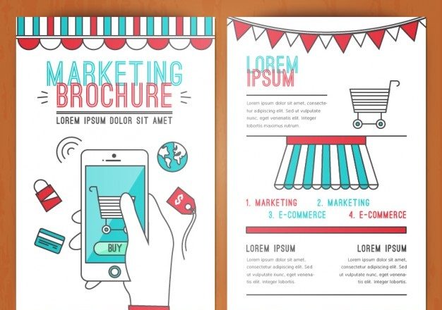
For many graphic designers, creating an amazingly designed brochure can be challenging as he needs to consider various aspects that materialize the information appropriately. If a brochure is designed aptly then it has the power to enlighten its readers about the brand quality, materialize the reliability and status of the organization, increase the engagements of the target audience, and motivate the customers to buy the goods and services.
So, to help you get an idea of how to create a good marketable brochure, here I am listing down a few tips that will hugely help you as a graphic designer:
Know about your customers: After you have finally decided that you have to convey your information to your customers through the help of brochures; make sure that you are able to portray their likes, tastes, and preferences. The more your brochure will present data according to the choices and preferences of your customers, more likely it will engage your target audience. So, try and get to know your audience. For this, you can either talk to your sales manager/ salesperson or directly to your customers. Their responses will act as the information which will help you to draft your brochure.
Know that what you are creating it for: To make your design considerable and relatable, it’s vital to know that why and for what you are creating it. The objective of creating the brochure will help you to design it in the right way. Garner all the information about the brochure so that you can appropriately create its design. This is because it will act as a medium between you and your audience and whatever you want to convey. So, everything needs to be accurate and concise.
Be unique: To stand out of the competition, try to think something out of the box. Uniqueness is one of the biggest parameters to engage your target audience. A simple design will simply be skipped off to contemplate a creative design. Not only you have to be unique but you also need to be comprehensible with your design and information. Plan a design that can be easily distinguishable in a pile of pamphlets which makes it eye-catching.
How to collaborate your information: After gathering all your information, you need to put it one space and that is your brochure. There are many ways to portray your data but I would like to tell you some ways which will maximally encourage your viewers to read and analyze your brochure.
Try to be restricted with the usage of fonts. It might be interesting for you to use a number of fonts but on the other hand, it might be discouraging for your readers to go through every piece of information that has been described in different fonts. You may choose a signature font for your company and can keep it all pervasive.
Don’t try to put in much of your information in your brochure. It will simply confuse your customers. Also, it will manipulate the crux of the main theme. Therefore, be precise and to the point so that your readers can instantaneously know that what you want to convey.
Avoid using big words. Complex words will make the readers lose their interests. Also, there’s a possibility that your readers may not understand the main theme of the information that you want to provide.
What you should write about: Sometimes, it may confuse you that what actually you should write on your brochures that will engage and motivate your customers to read it. So here I am mentioning some tips that will help you to write a good brochure.
Make your first page intriguing that will motivate your customers to go deep inside the brochure. They will be curious to know more about you, your company and your products. You can do it by telling your readers that there is something special inside for them like gift cards, vouchers, discount coupons, free invitations and so on.
If you have a brochure which is more than six to eight pages, then mention the contents that you have in it.
List down the benefits of your products and why it is better than competitor’s product.
Personalize your brochure.
Talk about your reader and his needs.
