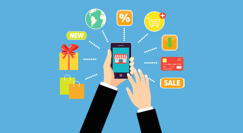
With mobile technology approaching near-ubiquity, people are increasingly using their mobile devices to browse and purchase products online. It’s important for online retailers to recognize and understand the massive growth potential of mobile.
Major population spends time on mobile browsing rather than desktop browsing. So keep in mind that customers will advance for purchasing on mobile differently rather than a traditional desktop site or brick-and-mortar location. When people browse on their smartphones, they value speed, responsiveness, and ease of use. As you build your mobile site, keep these expectations in mind—particularly as you continue to cultivate your social experience. A large portion of your social traffic will come via mobile, so it’s crucial for businesses to have a strong mobile presence capable of supporting these inbound customers.
To help you out, here are two things to keep in mind as you develop your mobile experience:
Differentiate your mobile experience from the desktop experience
Businesses often fall into the trap of treating their mobile site the same as their desktop site. Mobile parameters and specifications differ substantially from a desktop device, and elements like product display, navigation and checkout should reflect those differences. For example, while a drop-down menu might work well for a desktop site, they don’t always function properly on mobile.
Remember, speed is king on mobile. A study of Kissmetrics says that a one-second page delay can mean a yearly loss of $2.5M in sales for an ECommerce site making $100 daily. A desktop shopper might spend as long as a full minute on one page, but that time is cut in half for mobile shoppers. Make sure mobile overlays (for example free shipping coupon that pops up when a shopping cart is left lingering) are quick and easy to interact with.
To help you differentiate your mobile site from your desktop site, adopt the mindset of your customer. Think through the customer’s mobile journey step-by-step, as if you had no desktop. Are your customers able to access your products? Is the navigation smooth and accessible without a mouse? Do your pages land where you need them to? Your mobile site shouldn’t simply be a compressed version of your desktop site which fails to take into account your customer’s unique movements.
Take advantage of additional mobile-based touch points
Building your mobile site will take time and resources, but it shouldn’t be the only mobile channel through which you interact with consumers. As social and mobile often go hand-in-hand, you can also connect with consumers via multimedia messaging services or MMS.
Although texting customers might seem like an outdated practice, recent developments in messaging programs mean businesses can deploy MMS campaigns that incorporate images and videos. A sense of excitement around both of your brand and individual projects can be generated through a well-planned MMS campaign. You can create a valuable reference point for your subscriber by sending your customers a photo or video of your product in action.
As you refine your business’s mobile presence, you’ll quickly realize that even the smallest changes will often result in huge improvements for your customer experience and an increase in sales. In general, continuing to be responsive to your customer’s wants and needs will do a lot to bring shoppers one step closer to conversion.
We are from Ecommerce Photographers India. If you want to click eye grabbing images of your products then do contact us.